


In today’s dynamic landscape, we are witnessing a monumental shift from the paths of web2 to the territories of web3. This evolution demands a reimagining of branding strategies, offering a transformative journey for businesses and opportunities to improve user experience.
While web3 introduces technological changes, in terms of branding and user experience, a significant portion can still be rooted in web2 principles. For instance, blockchain transactions differ from traditional banking, yet the representation of transaction history for users remains consistent. The psychology of colors in branding also remains relevant as the technology transitions, with blue signifying trust and yellow conveying optimism, regardless of the web era*. However, as of today, web3 color palettes still tend to be influenced by its culture i.e. purple (which is widely used in web3) its important to note that purple represents different meanings in different countries. In Japan, it represents wealth while in Ukraine, it represents faith.
While foundational elements remain, the approach to a brand’s strategy undergoes a notable transformation. With new web3 projects continuously emerging, this poses new opportunities for creative designers and branding specialists working in the space. In this blog, we will explore the role of branding in web2 versus in web3, and examine case studies of compelling brands and assets for this new frontier.
THE WEB2 ERA:
In the Web2 era, branding followed a well-defined path. It revolved around crafting a polished image, formulating a compelling message, and presenting it to a receptive audience. This one-way communication channel had brands speaking, and the audience listening.
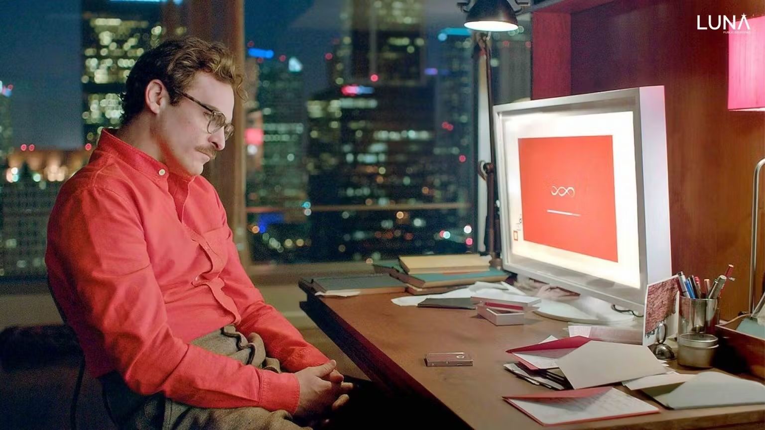
Branding in web2 meant less is more, with the majority of big players such as Apple, Google, Gucci, and more following branding techniques that were simple and minimal. Nowadays, we have a sea of web2 brands that sell different offerings, but all look the same. For example, the movie “Her” follows the same branding style and visual language as “Apple.” One is a film and the other sells technological gadgets. How can they have the same visual language? Some say this is due to the digitalization of content consumption and playing it safe to seem “familiar” to the masses.
Although there were multiple guides and credible sources for branding for web2, brands still opted to do things their own way, with the founders “favorite color” being the reason why they selected their primary brand color.
WEB3: WHERE DATA DRIVES THE NARRATIVE
Fast forward to Web3, and the landscape undergoes a shift. Here, data is not just a tool; it is the captain of the ship. We find ourselves in an era of decentralization and blockchain-powered experiences. Every interaction leaves a trace, and trust hinges not just on a brand’s promise, but on realistic, transparent, verifiable data, and establishing genuine connections with communities.
As we transition to web3, branding needs to adjust accordingly for projects and ideas to be successful. With the impact of past failures of the biggest crypto projects (for example: The Terra Luna Crash, Celsius Bankruptcy, or FTX Crash), it is essential to establish trust and credibility from the outset. This means going the extra mile to ensure that potential customers and users understand your brand’s value proposition.
A carefully crafted brand identity can make it easier to enter into the market, and ensuring your project looks legitimate, trustworthy, and visually appealing will be key in delivering the objectives behind your brand communication strategy.
Your web3 brand goes beyond being a mere name and logo; it morphs into a living, breathing entity, and it is essential that you have to invest the time establishing all of your brand’s elements and assets for maximum impact and success.
This is where we come in.
Luna PR has a mission: to connect tomorrow’s technology with today’s audience and to help projects gain momentum and achieve success.
BINANCE: WEB3 LUXURY
In this busy and saturated landscape, standing out from the crowd requires a unique and innovative approach to bring new business ideas into focus. Crafting something attention-grabbing amidst this rapidly changing landscape is no easy task.
Let us take a look at Binance’s brand identity as an example. Binance’s mission is to provide the core infrastructure services for organizing the world’s crypto, with a belief that this will improve lives around the world.

In terms of color palette, Binance uses a golden yellow, most frequently placed on a white, black, or grey background. Generally, golden yellow represents wealth and opulence with luxury brands such as Lamborghini, Lindt, and Louis Vitton incorporating those colors as well. At the end of the day, chocolate is chocolate, a car is a car and a bag is a bag. The reason why we choose these brands over others is simply due to the perception of luxury. When we purchase any of these brands, we are purchasing the perception of luxury and wealth.

Binance recognized this from the beginning and has spent the past few years imprinting this perception of superior quality onto everyone within the web3 space. Compare Binance’s icon to any other exchange’s logo, you will find an easy correlation. If Binance is “Lamborghini,” then by comparison Coinbase feels like Ford and Uniswap feels like Toyota. Given equal choice to pick, the majority of the world’s population would take the Lamborghini #wenlambo.
When taking a look at the typography, any branding specialist will instantly notice that Binance has opted for the contemporary sans serif font, Helvetica – a widely recognized font used across various platforms.
Fun Fact: Helvetica’s prevalence is so significant that it even garnered its own documentary, released in 2007!
When it comes to Binance’s international presence, this typography feels entirely fitting. Why would Binance select such a common font for its primary typography?
- The letterforms display a consistent aesthetic and possess a distinct adaptability that makes it suitable for nearly any industry, which contributes to its widespread use
- Simply because it’s familiar and relevant to the masses
Binances’ responsive UI/UX does not disappoint either, filled with gold-on-black clickables and where buttons and icons are neatly organized.
By far, Binance’s geometric icon is our favorite part. Geometric shapes aren’t new in the tech industry, but Binance makes great use of them.
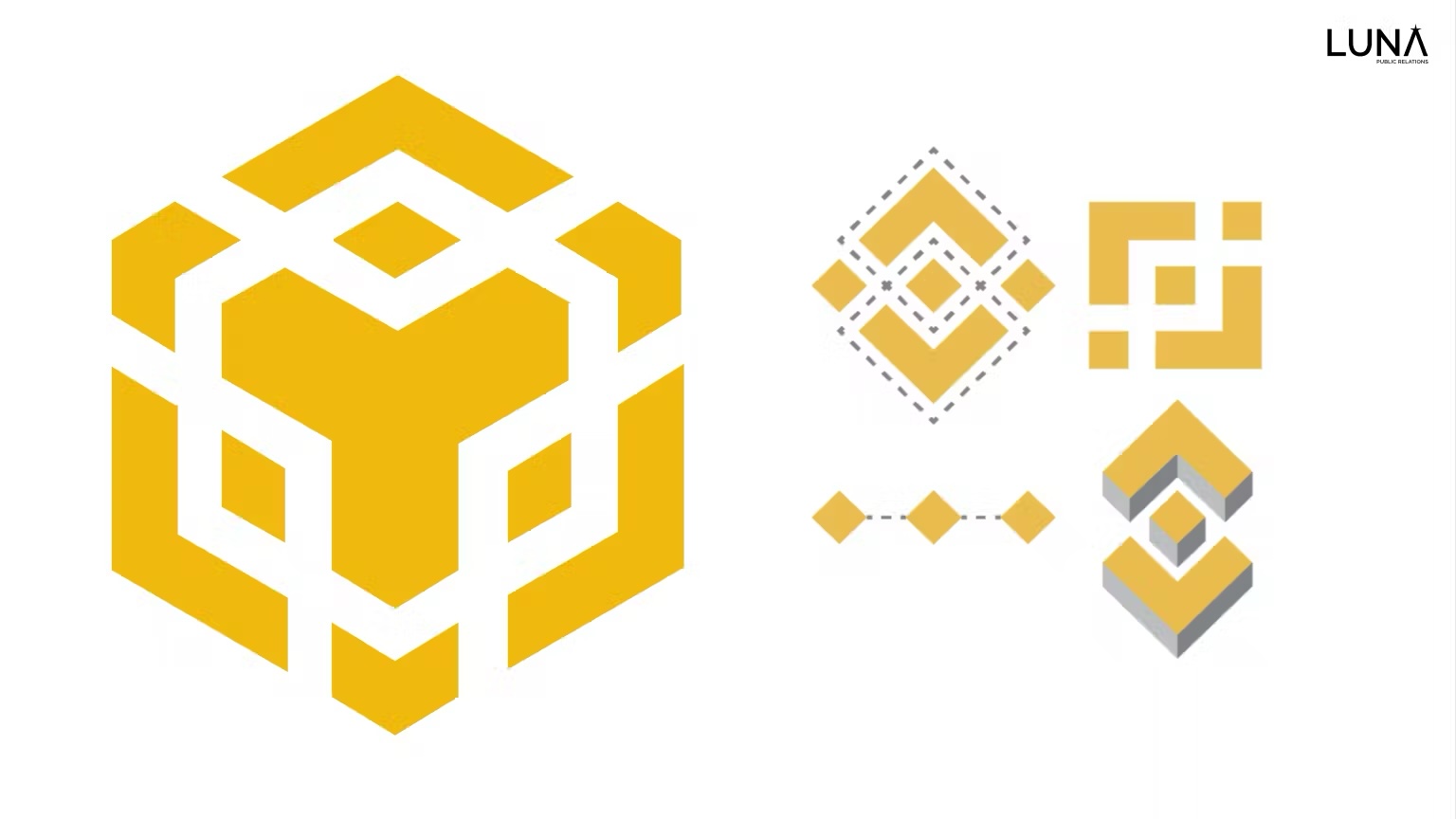
Binance repeatedly presents the masses with solid squares, and repetition is an important memory tool (and also great for brand recall). The solid squares represent a solid and stable foundation, to which Binance wants to be remembered by.
However, this square can also form a diamond pattern, and human minds like to complete patterns and show us objects that aren’t necessarily there. The diamond pattern is a very clever way to represent blockchain technology. The use of these squares repeatedly makes it very easy to imagine the “top of a cube.” Sound familiar? This was the concept used when Binance launched Binance Chain.
Did we, as consumers, make Binance the largest exchange because we decided to? Or did Binance make us perceive higher quality from the moment they launched?
BRANDING 3.0:
The rules of branding are being rewritten. It’s a call to embrace data, transparency, and community. It extends an invitation to be more than just a brand but a trusted companion. Branding for web3 is still in its early stages and we’re proud to be at the forefront of this learning curve, so if you need branding advice, you know who to come to.
A compelling question for me to leave you with is: “If your brand were a living, breathing individual, what qualities would he/she embody?”
Let these qualities guide the foundational pillars of your company’s identity.


